Play by Instinct: Jazlyn Fung Hei Man’s favorite playful fonts.
Foundry collection
Typography
Type design
What happens when we leave behind traditional constructs and expectations, and instead embrace play and exploration?
Through three collaborations with multi-disciplinary creatives, we’re exploring just that — what happens when we create for the sake of creating, and the ways creativity and intuition can transform typography into a playful and multi-sensory experience.
Our collaborator for this part of the series is Jazlyn Fung Hei Man, a type designer from Hong Kong and Australia. Read on for her favorite playful font selections from Monotype Fonts.
Monotype Modern MT®
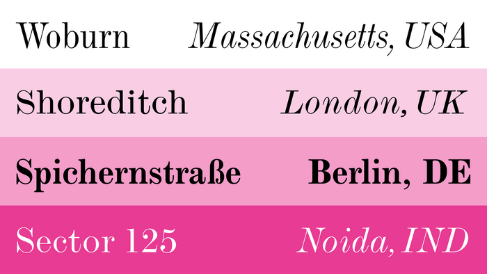
Monotype Modern MT® is a refined Didone typeface with extreme contrast, vertical stress, and razor-sharp serifs, giving it a timeless and elegant appearance. I particularly love the M and N, where the clean, sharp corners and striking apexes create a beautifully structured rhythm. The sharp contrast and delicate serifs add a sophisticated touch, giving the typeface that regal touch that makes any text look instantly refined.
Moldyen Regular
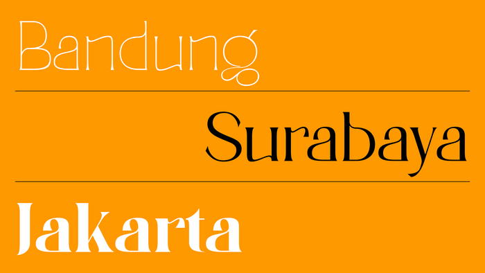
Moldyen Regular’s organic curves and controlled contrast give it a humanist feel, blending tradition with a modern touch. The slightly irregular shapes introduce fluidity, breaking away from rigidity while maintaining strong readability. I particularly love the elegant shoulder of the m and u. The subtle details, especially the finials, make these letterforms intriguing and add a unique charm to the typeface.
Mabry™ Bold
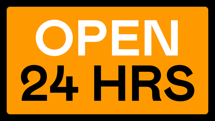
I love Mabry because it feels confident without being too rigid. Its compact forms give it efficiency, while the even weight distribution ensures strong legibility. What stands out is the distinctive bowl shape, particularly in the Q, which adds a playful character to the typeface. This design detail balances structure with subtle warmth, making it both functional and visually engaging.
Value Serif™ Bold
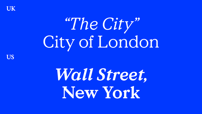
This serif has a striking, editorial feel. The apex is bold yet playful, exuding both confidence and refinement. I also find the Q particularly interesting—the tail has unique detailing, and the sharp terminals add an extra layer of sophistication. These design elements give the typeface a distinct personality while maintaining a sense of strength and clarity.
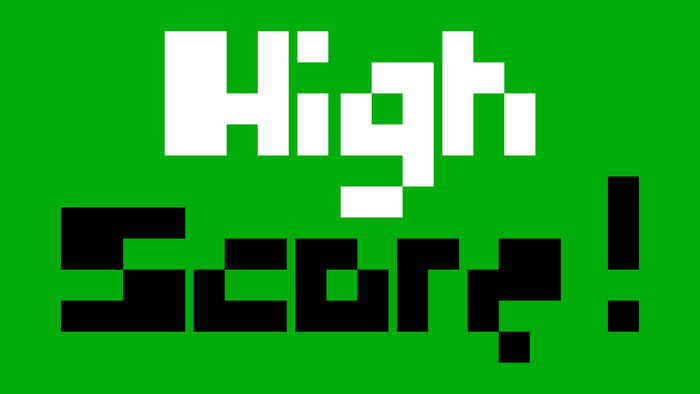
Pcsterry Pro Regular
There’s something intriguing about Pcsterry. The pixel-like shapes add an experimental touch, while retaining legibility. I can imagine the type designer enjoying the process of exploring this typeface on grid paper, playing with its form and structure to create something both playful and purposeful. It balances geometric precision with humanist details, offering a unique and engaging design that’s still legible.
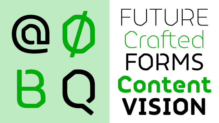
FS Alvar® Regular
I love how FS Alvar is clean yet inviting. It strikes a balance between being professional and versatile without feeling too corporate. I can see this being perfect for a signage project, where it would bring a playful touch to both print and digital formats. There’s something about its design that gives off a futuristic, almost spaceship-like vibe—spirited, yet balanced. I think it’s a great fit for projects that require a modern, approachable look while ensuring clarity and legibility.
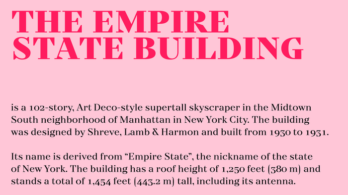
TT Nooks Regular
TT Nooks feels classic with a modern edge. The carefully crafted serifs give it a contemporary look while staying grounded in tradition. I’m particularly drawn to the unique design of the legs and arms, which have an interesting shape that adds character. The slightly exaggerated triangular forms create a distinct rhythm, making it ideal for typography that’s both expressive and sophisticated. I also find the punctuation details intriguing, like the question mark, where the bottom of the dot has a playful touch.
M Bitmap Square HK
For my final choice, as I grew up in Hong Kong, I chose a traditional Chinese font that I find playful. M Bitmap Square HK’s pixel-based structure gives it a digital, retro feel, while the square form adds precision and balance. Despite its pixelated design, it remains highly readable, making it suitable for both print and digital use with a playful yet structured look. Although this font is commonly seen in digital signage in Hong Kong, I still appreciate its charm. The city has made efforts to preserve and modernize traditional fonts like ‘Prison Gothic,’ blending heritage with modern signage. While M Bitmap Square HK is distinctive, other fonts are more widely used for regional signage.

Browse 250,000+ fonts from more than 2000 type foundries.
Available now on Monotype Fonts.